Increased
0%
Customer satisfaction
Measured growth after consolidating four journeys into one unified, real-time experience.
Annually
Information associated with transactions in a B2B banking world is extremely crucial — requiring 100% accuracy, real-time data, and an efficient system for users to make informed decisions.
The current system is a 20+ year old legacy application, developed over time, resulting in complex and convoluted user interfaces that are difficult to navigate and inefficient. I took on the challenge of redefining the existing journey of managing payments efficiently.
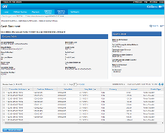
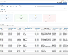
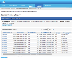
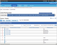
The current solution does not allow users to view inter-related data of a payment or an account at once, forcing them to hop between four different journeys. The process is not seamless and results in mass duplication of data — adding to increased page load time.
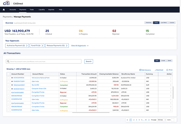
Harmonize the process of managing payments. Craft an efficient solution that gives users all the relevant information within the same journey, in real time, so they can make informed decisions and take further action.
There were three major challenges faced across this solution:
The process began with identifying and discussing business challenges and opportunities together with relevant stakeholders.
My Role — UX Lead. Responsible for crafting the solution from the beginning, leading the design process with cross-functional team communication.
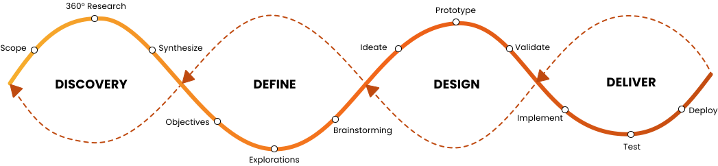
After initial discussions with key stakeholders, we defined the high-level problems and the functionalities to be worked upon:
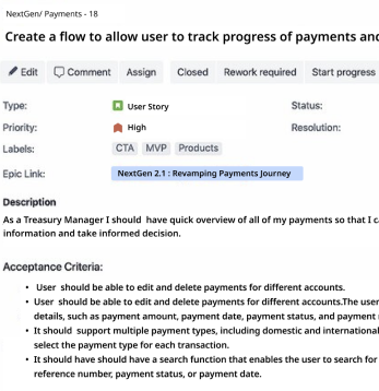
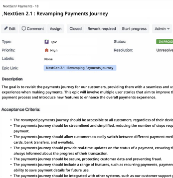
We engaged in client and stakeholder interviews and gathered feedback from multiple channels to get an overall view of the problem statement — covering everything from "where is my payment" to "how many payments are pending approval."
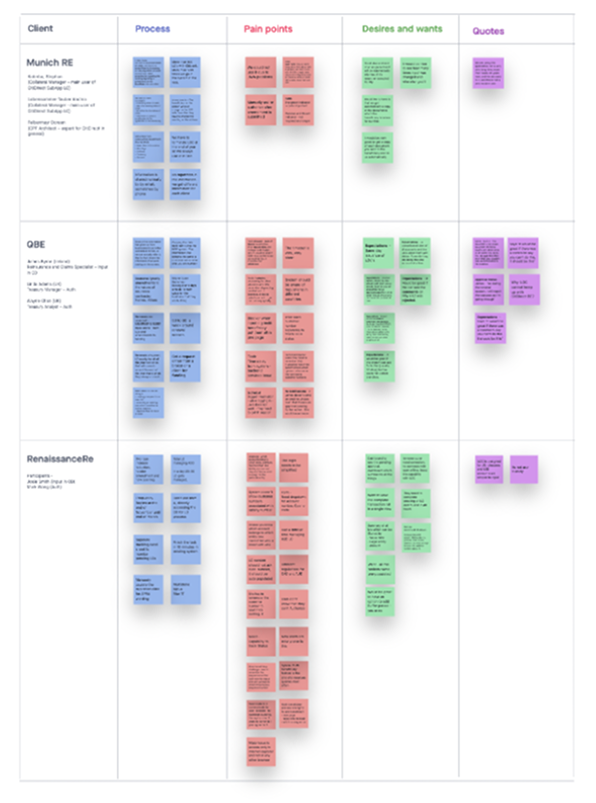
Two primary personas emerged after synthesising the research data.
I ran a workshop with stakeholders to finalise the information architecture, and worked with product owners to map screen flows. From there, we ran low-fidelity wireframing sessions — making sure every idea stayed research-driven and functional, with multiple brainstorming sessions across the UX community to avoid designer bias.
We created low-fidelity ideas with all the information gathered and made sure all the ideas are research driven and functional.
We had multiple brainstorming sessions within the UX community and with stakeholders at this stage to avoid designer bias.
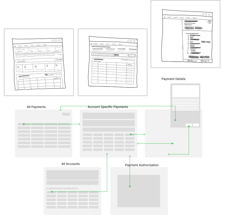
Once we completed the prototyping, we took our designs to clients for usability testing.

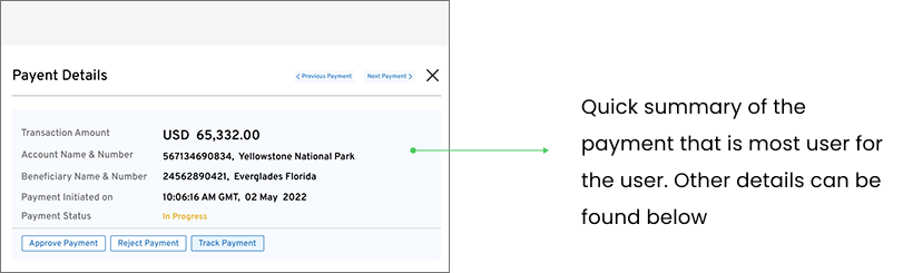

From mockups to production, with a feedback loop built in for what comes next.
Mocked up all user journeys and flows, then showcased them to stakeholders, product owners, and other project members for validation.
Modified a few UI elements due to technical constraints during build. Quick fixes shipped immediately; higher-impact changes were prioritised as backlog items.
Audited the shipped flows post-launch, flagging design and experience gaps against expectations, and prioritising them for upcoming sprints.
Partnered with client-facing teams and used feedback forms to understand what wasn't working, while monitoring user retention on the new designs.
A unified, real-time view of payments — measured in satisfaction and profitability.
Measured growth after consolidating four journeys into one unified, real-time experience.
AnnuallyImproved efficiency and faster payment decisions contributed to quarterly profitability gains.
QuarterlyOne unified journey, in real time — instead of four disconnected ones.